 |
|
|
Buenos Aires / Argentina |
| especiales > UN Studio - Ben van Berkel / Galleria Hall West, Seúl, Corea del Sur 2003 -2004 [05/03/05] |
|
|
| |
|
Galleria Hall West, Seoul, South Korea 2003 -2004 Project description - Design of exterior Façade - Refurbishment of Interior - Design of Interior Furniture and Landscape - Design of related exterior spaces
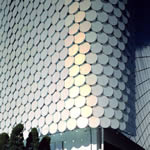
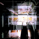
Magnetic Geometries Within Seoul, the Galleria Department Store exists within a typical system of highly specialized department stores, each representing a microcosm with its own eco-climate to which its customers are finely attuned. Situated at the top end of this system, the Galleria Fashion Hall together with the Galleria Masterpiece Hall in close vicinity carry a large number of highly prestigious brands and consequently attract visitors from a wide area, including Japan. The Galleria Fashion Hall is prominently situated in the Apgujeong-dong district, on of the trendiest commercial districts in Seoul. However, from the outside the store appears unremarkable. In October 2003 the Galleria hired UN Studio to design a new façade and interior to mark the store’s transformation (in their own marketing-originated words) ‘from novel to noble’, becoming more ‘luxurious’ while remaining ‘trendy and unique’. UN Studio’s exterior renewal, completed in September 2004, exists of the application of 4330 glass disks on the metal substructure that is directly attached to the existing façade. These discs are treated with a special iridescent foil, which causes constant changes in the perception of the façade. At night, a special lighting scheme, designed cooperatively by UN Studio and ArupLighting, illuminates the discs by reflecting the dynamics of the weather conditions that happened during the day. The interior renovation is focused on the general store areas in between the individual branded shops. UN Studio has sought to streamline the circulation spaces, providing ‘catwalks’ of light-colored, glossy co-coordinated walkways and ceilings, which improve orientation and give the store a super-bright, fresh image. 1) Interior concept: For the updating of the existing interiors, our inspiration is the fashion catwalk; the customer should find himself in the focus of the fashion world, feeling himself/herself as the attractive model in midst the glamorous Fashion Hall. The interior design focuses on the elimination of superfluous and outdated details and the introduction of two new Big Details: the escalator which becomes a moving event space, and the ceiling lighting which becomes a device that provides a fluent directionality and dynamics to the shop floors. 1.1) Lighting and concept for interior catwalks: For the main circulation corridors (catwalks) the lighting is integrated within the dropped ceiling. The illumination of the corridor is designed as a continuous lighting element, which consist of linear rail following the direction of the corridors and bending whenever there is a change in direction. Below these rails a white plastic foil is stretched and on every second rail TL-lights are mounted. The semi-opaque white foil spreads the light equally creating a continuous field above the main corridors. The combination of up-lights and rails casts multiple shadows on the white foil that create depth in the ceiling and where directions change, these shadows emphasize way-finding. The rails are straight along the corridor’s length and turn the corners, always keeping the same radii. Where two corridors connect in a T-crossing or X-crossing, the rails bend to accommodate directions. Lights used above Corridor ceiling: Straight corridors: PHILIPS-TMS 206-128 (840), PHILIPS-TMS 206-114 (840) Round corners: COLD CATHODE LIGHTING – LAMP COLOR MATCH TO TMS 206 (840) Plastic foil material: Barrisol, Venus blanc Color scheme: Color was also added to the primary rails in the ceiling package, the effect is a subtle tint of color created by the combination of lights and the plastic foil. The color tint is also reflected in the highly polished artificial stone used to pave the corridors. The gradient of color and the intensity was carefully chosen as not to influence the lighting of the products in the stores. 1.2) Lighting and interior concept for enclosure of vertical circulation space: The walls enclosing the escalator space are designed as a series of vertical IPE-beams that are clad from both sides with glass. Towards the inside of the escalators the glass is finished with a partially transparent, reflective foil so that customers on the escalators perceive the space and the relation to the other floors more intensely. The glass on the opposite side of the construction facing the stores is translucent which allows for view corridors overseeing the main vertical circulation space behind the benches – the public meeting zones designed for Galleria. In the vertical walls large display pockets are integrated that can be used to transmit information projected simultaneously to the exterior façade and can be used for branding and advertisements. The vertical enclosure and the display pockets continue into the ceiling of the space. The lighting of the escalator walls is done with Cold Cathode lighting, which is located in between the two layers of glass in vertical arrangement. These light strips cast white light and illuminate the space by soft animation in vertical direction. The underside of the escalators is illuminated by strips of Cold Cathode lighting covered with color filters casting the same colors as used for the identification in the ceilings on the different floors on the angled surfaces underneath the escalators. The colored light is used to enhance the directions of way-finding and guide the customer from one floor to the other. 2) Exterior Façade Concept: The effect we were trying to achieve with the facade is to generate a lively surface that fascinates, attracts and always looks different, depending upon the point of view of the spectator and depending upon the time of day and time of year. The visual theme we have chosen for the façade design is that of a geometrical pattern based upon the circle which is repeated and generates a surface. In total 4330 glass discs are hung from a metal sub-structure that is directly mounted on the existing concrete cladding of the department store. The glass discs are made of sandblasted laminated glass, including a special dicroic foil. Testing different materials and combinations of foil and glass finishes was essential during the process and several on site mock-ups were made in order to test and forecast the effects generated during day and night. Day: During the day the atmospheric and weather changes influence the degree of reflection and absorption of light and color on the glass circles, so that from different viewing points the appearance of each disc and the total surface changes constantly according to those external conditions that are beyond human control. Night: During the night situation of the building the lighting design developed for the façade additionally starts to interact with the material condition of the glass discs. By placing behind each of the glass discs an LED-light source and by controlling the lights digitally one by one, the possibilities to manipulate color and light emission become endless. Recording day-to-day weather conditions and processing the data with the computer before projecting them in transformed version onto the glass skin is just one out of many possibilities of the technology used. Our façade solution also has the potential to be adapted for special occasions and can be changed over time according to seasons, fashion events and artistic inspirations. Nevertheless, the character of the glass disc skin is different from the principle technologies used in screens, since whatever visual information is projected onto the discs; it will be transformed due to the material conditions of the glass disc and foils. The new façade is not a projection screen in the conventional sense, but it interacts with the projected information and generates a circular pixilated visual face by night.
Quotes Ben van Berkel: “As an architect I am interested in dressing the future. Like a fashion designer, but on a much larger scale, I am helping the world figure out how it will look tomorrow.” “This is a building for living design, not dead art. What you find in The Galleria is stuff that lives for today. Beautiful, gorgeous clothes – carefully selected from the best designers in the world. It is a wonderful, living collection that changes with every season, changes in composition every day. And our design reflects that; the facade causes a continually shifting, shimmering, alluring perception – the system of the colored glass disks and the super-bright catwalk interiors represent a concept of magnetic geometry.” Credits Galleria Hall West, Seoul, South Korea 2003 -2004 Client: HANWHA STORES CO., LTD Design Architect: [Schematic Design and Design Development phase] UN Studio: Ben van Berkel and Caroline Bos with Astrid Piber, Ger Gijzen, Cristina Bolis, Markus Hudert, Colette Parras, Arjan van der Bliek, Christian Veddeler, Albert Gnodde, Richard Crofts, Barry Munster, Mafalda Bothelo, Elke Uitz, Harm Wassink Design Advisors: Structural engineers: Arup & Partners, Arjan Habraken (Schematic Design) Lighting Design: Arup Lighting, Rogier van der Heide IALD (Schematic Design and Design Development) Wayfinding Design: Bureau Mijksenaar, Martijn Geerdes (Design Development) Executive Architects: Façade Design: RAC – Rah Architecture Consulting Interior Design: Kesson International Contractors: Façade construction: Dongshin C G E Co. Ltd, Dongshin Glass Co. Ltd. Façade Lighting: Xilver B.V. Interior construction: Hanwha Engineering & Construction Corp. Façade construction: Hanwha Engineering & Construction Corp. Planos >>> Imágenes gentileza > UN Studio |
 |
 |
 |
 |
|
 |
 |
 |
 |
 |
|
Links > Otras obras: Mercedes Benz Museum, Stuttgart / VilLA NM, Upstate - Nueva York |
||||
|
|
|
diseño y selección de contenidos >> Arq.
A. Arcuri
|
|